
In Part 1 of this article, we got a behind-the-scenes look at the equipment, lighting and shooting setup used by Ryan Matthew Smith to achieve the stunning food photos in Modernist Cuisine. Now, we’ll take a look at the second step in the process: cleaning up your pictures in Photoshop to really make them come to life.
Ryan is amazingly talented with Photoshop and he has shared some of his favorite tricks and techniques with me. There is a lot more to be learned than what’s covered in this article, but this is a great start for any food photographer looking to squeeze a little more succulence out of your shots.
The steps below are my attempt at cleaning up the grapefruit picture shown here. Although my process achieves a similar result to Ryan’s work on the same photo, chances are, an experienced Photoshop guru like Ryan can correct this image faster, cleaner and more accurately. However, as I was quite pleased with the finished product, so I thought I’d share my steps with you.
At the end of the article, I’ve listed a handful of other useful Photoshop tips that Ryan was kind enough to share.
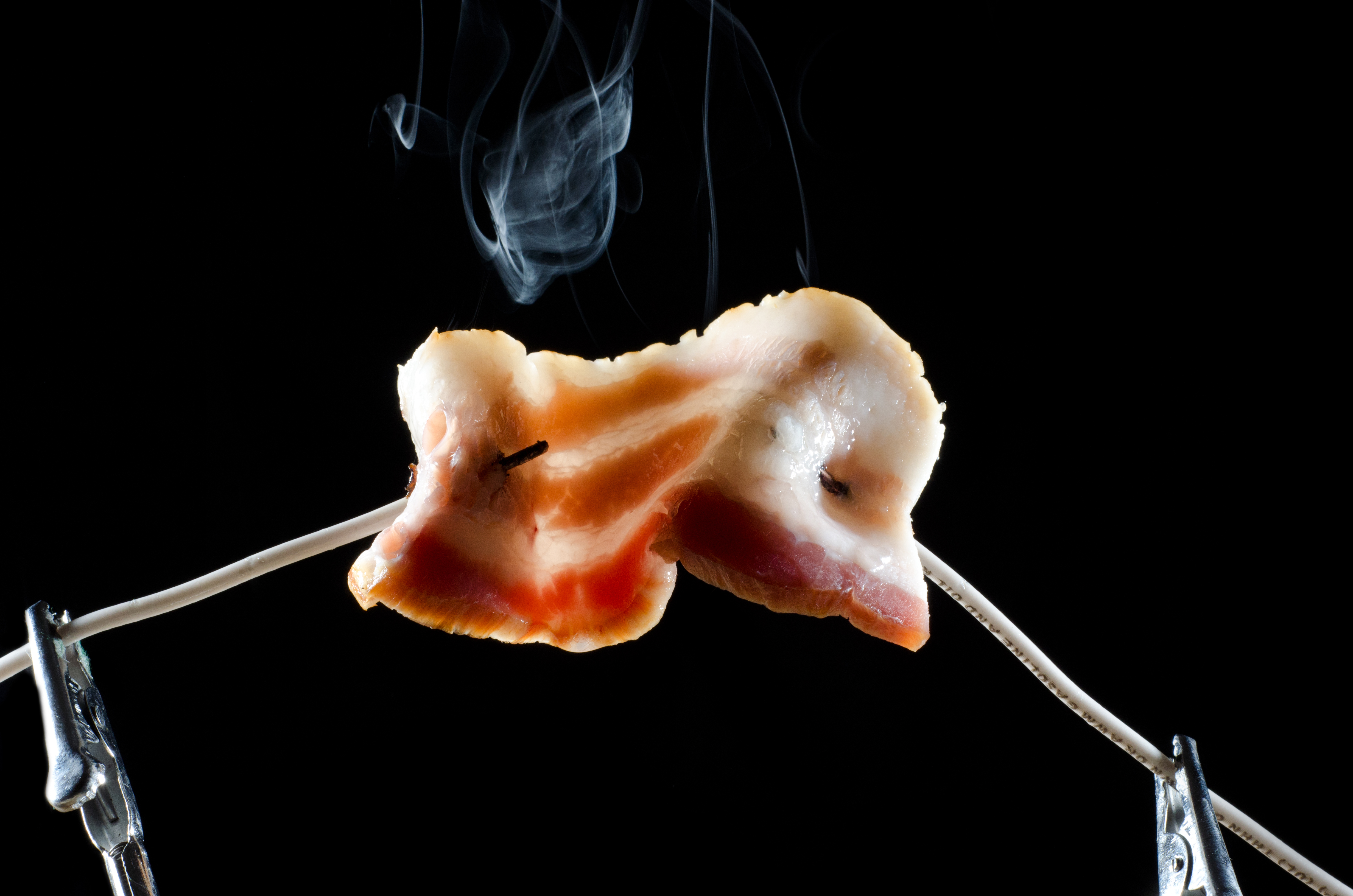
1. The starting image.

This is the starting image, unaltered, straight from my camera. It looks pretty decent – sharp edges, solid black background, good highlights on the left side of the fruit. However, the colors are dull, there’s very little contrast, and this picture doesn’t make me nearly as hungry as the one from the book.
As you can see, when we open the image, it appears in the Background layer. For each of the manipulations we’ll make, we will add a new layer that contains the adjustment and blend it with the background layer. This lets us stack up our adjustments additively, but with the ability to go back and tweak a previous step without having to undo and redo a bunch of work.
2. Correcting Color
The first correction we want to make is to the color of the image. Our grapefruit slice doesn’t look super vibrant (or delicious) coming straight out of the camera. We want to make the colors bolder and more appetizing.

First, we’ll create a new Adjustment Layer (Layer > New Adjustment Layer, or by clicking the black and white circle in the bottom of the layers pane). Choose type Curves. If you want to learn about Curves adjustments in more detail, here is a very detailed tutorial on tonal range and curves.
Before we start adjusting our color curve, though, let’s set the Layer Blending method to Color. This means that the adjustments we make in this layer will affect the color of the background layer. 
Now we can start tweaking the colors of our grapefruit. It looks to me like it needs a little more red and a little less blue. Expand the dropdown in the Curves tool and select Red. Grab the curve at several points and start pulling it up or down to make the adjustments you like. Then, if necessary, repeat for the Green and Blue channels. 

The curves above looked about right to my eye. The grapefruit is already looking a lot better, but it’s not quite “ripe” yet. One problem I notice is that the thin, fringy areas along the top look too red now. They’re so thin that they should be nearly white from the light of the flash passing through. We can adjust this by Masking the color adjustment layer so that part of the image isn’t color corrected.

Click the layer mask on the adjustment layer we just created. Switch to the Paintbrush tool and make sure the foreground color is set to Black. I use a brush with very soft edges and an opacity set to ~30% so the correction is a little more subtle. Using this brush, with the layer mask actively selected, paint over the areas that you don’t want to be as affected by the color correction. In the screenshot above, I’ve selected the areas I adjusted so you can see the effect.
3. Correcting Lightness
At this point, we’ve got a more vibrant grapefruit color, but it’s still a little dim and dull. We can correct this by creating a Lightening adjustment layer. 
Following the same process as the previous step, create a new Adjustment Layer and select Curves. Set the Layer Blending mode to Lighten this time. Then, play with the curve until you get something you like. In some cases, you won’t be able to get the lighting right throughout the whole image from just one adjustment layer. For example, your lighting may look perfect on one side of the image but it’s blown out or underexposed on the other. If this happens, you can simply mask out the parts of the adjustment layer you don’t want, just like we did with color, above. Then, you can add another adjustment layer of the same type to optimize another section of the image.
4. Hard Light
Now we’ve got our image color corrected and light-adjusted, but I’d like to see a little more contrast between the walls of the fluid sacs and the sacs themselves. This is the kind of texture that jumps off the page in the Modernist Cuisine book. 
To do get this texture, we’re going to do something a little different this time. Rather than creating an adjustment layer, we’ll create a copy of the Background layer and set the Layer Blending mode to Hard Light. Immediately, we get a huge boost in texture, maybe too huge. We can dial this down by adjusting the Fill level for the layer (in the Layers palette, upper-right) until we have just as much of the effect as we want.
5. Sharpening
To make the image pop even more, we’ll add an Unsharp Mask (Filters > Sharpen > Unsharp Mask). Contrary to how the name sounds, this filter will actually make the image appear sharper. Note that this won’t fix images that were out of focus to begin with, and the more you sharpen, the more noise you introduce into the photo. In this case, we’ve got plenty of resolution to work with and the noise doesn’t bad when the image is scaled down for the web.
 Finally, we want to tidy up the reflection and take are of any other random light areas that appear in the original photo. We can shorten the length of the reflection by creating a new Layer, in this case a normal layer, and using the Gradient Tool with the color set from Black to Transparent. Drawing a straight line up from near the bottom of the image to where the grapefruit meets the surface will give us a nice fade in from black.
6. Masking the Reflection

In the same layer, you can use the Brush to black out any other areas where color appears, such as in the lower left of the screenshot above.
8. The Final Image
There you have it, the final image! It’s a far cry from the dull, flat version we started with, and it actually looks much closer to the appearance the grapefruit slice had in person.

Other Tips from Ryan Matthew Smith
- Automate! I definitely use actions and scripts when I can; anything you can do with the same quality AFK (away-from-keyboard) you should. For more information on automation, see tutorials on Lynda.com (paid), or any number of other tutorials.
- Calibrate Your Monitor. It’s nice to have a photo spectrometer like an eye-one or a Spyder. Or borrow a friends!Also pay attention to your monitors shortcomings if it has any. Mine at the office have really bad performance in darks so I can never tell what details I might be losing when dropping exposure. I try to check photos on my home machine before dropping them into the layout.
- Color Profiles. I work in adobe RGB 98, my monitor can display most of it where the ProPhoto color space is way wider gamut than my monitor. Always convert to sRGB for web. If you’re printing on someone else’s printer, get their profile and convert your file before it sending off.
- Use JPEG Compression. When saving images for the web, I like JPEG compression. It has better quality compression at small sizes from my experience. It’s important to remember average Internet speeds are high enough now that compressing with Photoshop’s “save for web” is not always necessary.
- Backup your Data. Everyone should have a mirror raid HD setup or backup frequently. Nothing’s worse than losing all your data.
- Organize your photos so you can find things years later…detailed keywords are great, at the very least detailed folder names for shoots so you can at least search by title. I keep all my favorite edits in a small subset of folders so I can check the metadata for shoot date. All my RAWs are cataloged by date.
Have you experimented with Lightroom at all? I’m in love with it. It can do all those same adjustments but in a somewhat more “orderly” approach b/c of the pre-defined workflow. I’ll give you a demo sometime if you want, it might be fun to bring this same image in and see if we can get to a similar result faster.
You won’t be able to do those weird RGB curves in Lightroom, but everything else would be possible there and most likely faster than PS.
I also have to question the choice of USM settings. That’s a large amount and a large radius with no noise filtering. There are several techniques that would yield superior results such as Smart Sharpen, HiRaLoAm sharpening or high pass filtering.
These pieces rlealy set a standard in the industry.
Hi Scott,
Great to meet you! We’re putting together 99 resources to help foodbloggers take better photos. We’d love to include this post as a reference, and are asking your permission. Do let me know if you are okay with referencing you!
Cheers,
Christine
christine@knapkins.com
Eeeeeh man , im so glad ive found this site , very very helpful for my hobby….as for the book , never heard of it but next stop…Amazon.
cheers
Alan http://www.alanspedding.co.uk http://www.cumbriafoodie.wordpress.com
Pingback: MUI7GLkEnc MUI7GLkEnc
Pingback: Idee 112: fotografia. Photoshop, tra vecchie polemiche e nuovi dubbi - Nuovo e Utile | Teorie e pratiche della creatività.
Pingback: Boosting Your Web Site Design Skills To Achieve Your Potential | Shining a Light on Hidden Facts
Pingback: Creating Your Own Personal Internet site? Employ These Tips For Achievement! | IntelliPack
Pingback: Want Fantastic Ideas About Web Page Design? Appearance Here! - Saude e Ciencia
Pingback: Want Great Ideas About Web Design? Appearance Right here! | IntelliPack
Wow that was unusual. I just wrote an really long comment but after I clicked submit my comment didn’t
appear. Grrrr… well I’m not writing all that
over again. Anyhow, just wanted to say wonderful blog!
Great website you have got here. Keep up the good work and thanks for sharing your blog site it really help a lot.
https://hpx7.com/ 바카라사이트
Thank you for sharing this. Please visit our website. Click the link below ….
바카라사이트
This is cool and great article keep it up. Hello guys this site will help you too come and click it
https://yhn876.com 카지노사이트
Explore your own soul.Do not rely on anyone else, but only on your own strength. Keep others out of your journey. Keep in mind that this is your own way, and that you should go alone. Although you can walk with others, know that no one else can take your chosen path. 호두코믹스
Hello guys! I’m inviting you all to visit our website ^^
It will surely amazing and for sure you will love this.
Here, check this out
바카라사이트
What a great article! It is an honor to read like this, such a full of adventure. Thanks for sharing this.
카지노사이트
Great article, this is not boring to read and
many thanks I found this.
If u have extra time, please visit our website.
Hope you enjoy !
바카라사이트
https://yhn777.com 바카라사이트
GREAT POST! I really love it.
keep up the good work!
Please click our link below.
바카라사이트
https://yhn777.com 바카라사이트
Good work! I must say this kind of blog was enlightening and inspiring.
Keep it up!
카지노사이트
Its so great and fantastic article im excited to read more!
카지노사이트
https://yhn876.com 카지노사이트
Wow! You have improved so much!
https://gamerphilippines.blogspot.com/